Making Multi-Column Text Work
Er, whoops! If you wanted to comment on this entry, or trackback, I apologize. I accidentally had those turned off. Trust me, it’s not personal. Now, feel free to either rant or rave.
Well, it’s still the end of my rant, but Misuba left a comment on my previous post (prior to this update) with a link to a well-executed site that also used 2+ columns of text in some places. I found myself writing a long comment to detail the reasons I thought that this ezine worked while the Independent’s site did not. Comments aren’t really the place for that kind of thing, though, so here we are.
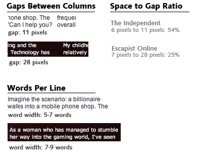
I definitely agree with Misuba, the site for Escapist Magazine is great. It’s well-designed, fairly unique. It’s easily the best ezine I’ve ever seen, and even surpasses a pseudo-professional PDF production I read lately. If I were to outline what I’d say were the reasons that works, while the Independent’s layout doesn’t, it’d go like this:
- The columns of text are wider in terms of number of words
- They are spaced wider apart
- Spaces between words are very small compared to spaces between columns (significantly reduces the chance to confuse a column gap for a big space)
- Every page of Escapist is short enough to all fit on one smallish screen — no scrolling
- It’s a much more considered decision, vs “we’re in print, it’s what we do” (in other words, it serves an artistic purpose and it’s clear they considered the ramifications beforehand)
For comparison, here’s the Independent layout again:

And the Escapist layout:

Take a look at this second screenshot. As in the screenshot for the Independent, this screenshot actually shows the narrowest gap between columns (I guess they tend to happen in early paragraphs for some reason). You can tell that the gap is much bigger in the Escapist design versus the Independent, and frankly this gap, narrow as it is compared to the rest of the site, is not very narrow when considered in a vacuum, or compared to the width of the space between words.
Or, you can just ignore all that nerdy rambling and stare at a shiny picture:

I also think, but wouldn’t go so far as to really argue, that the higher contrast between background color and text color helps. Furthermore, Escapist uses the trick of breaking up the last sentence in a column so that the last line is very short, and only a fragment of a sentence, which helps lead the reader to the next column without thinking too hard about it—get ’em in mid-thought seems to be the approach, and it works.
So, in closing, multiple columns aren’t always horrible (especially if you’re a trendy artistic thing like an ezine). But generally speaking, they’re too evil to be left in the hands of just anyone. Then again, that could be said about most things. I stand by everything I said about the Independent, but there are folks out there proving that multi-column text isn’t the problem in and of itself.
Also, crow tastes delicious.


I respectfully disagree about The Escapist… I read a few article a while back (great content) then gave up on their fancy layout completely, because it is utterly broken with respect to font sizes – when I use the font size adjustment feature of the browser (hoping for readable text on a high-res screen), it turns in to a jumble.
Fortunately, there is hope… there is a "text" link at the bottom to, uh, escape from the pretty but unreadable layout, to get the text in a readable, scalable form. Alas, the rest of the layout is gone also, along with the illustrations.
It seems to me that good web layout can be attractive, themed, illustrated, yet still not assume a fixed text size.
Gonna have to give it a try.
Gonna have to give it a try 🙂
I think it would be usefull for other users also!
Thanks for taking the time to do it…
Thanks for taking the time to do it.
But I’m not sure why…
But I’m not sure why.
But I’m not sure why!
The content of your show is great, I really enjoy it…
The problem is my browser 🙂
Good idea 🙁
Very nice write up…
Well at last catched the problem!
Well at last catched the problem 🙂
Gonna have to give it a try…
Gonna have to give it a try.
I had and the fix I found 🙁
Very clear…