


Remember Kids, Web != Print
One of the biggest sins you can commit when designing a web site is acting as if you’re designing for print. The web is not print. The elements of design which carry over from print are there, to be sure, but they are extremely non-specific (e.g., spacing of text headings). Computer interfaces are not static, they are much lower resolution than paper, and importantly, people don’t use them the same way. This is part of why nothing’s killed paper publishing yet…
Here’s example number one of what not to do:
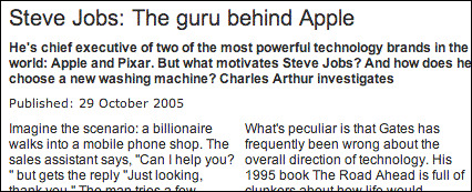
Usually the painful print legacies have to do with huge images, images instead of text, and that sort of thing. This isn’t one you see every day, but it’s an especially idiotic decision. Does no one at The Independent ever try to read articles on their own site?
You don’t have to scroll a newspaper. Their web site, on the other hand, is impossible to read comfortably. Sometimes you can get away with multiple columns of text—if they are separate content pieces, and if they are far enough apart that the right column doesn’t continuously confuse the reader’s eyes.
OK, end rant.
Update
I wrote a follow up here. Thanks, Misuba.


Expect to see this layout more and more when CSS3 columns are in common use… in about 27 years.
hehe, to their defence they do have an option to make articles single columns, ala iht.com… Not that it’s helping them much though. What’s particularily annoying in this example is the scrolling required to read each column. good rant.
That’s funny, I had exactly the same thought just last week. Well done!
Yes, I read this same article a couple of days ago and was similarly annoyed. They could at least put a link at the bottom of the first column that takes you back up to the top of the second. Thanks for the nicely-written confirmation of my own annoyance!
An example of columns, and indeed a lot of print aping, that I think is working really well in the browser: http://www.escapistmagazine.com/
Misuba, that site is actually really cool. Color me surprised. I like! I’m updating this article with an explanation of why I think that site works while the Independent doesn’t.
Thanks a bunch for pointing it out. Aside from being a well-executed layout for an ezine, it’s a topic of interest for me 🙂
I was very dissapointed of this 🙁
Not really new.
i am not sure as to why 🙂
The problem is my browser 🙁
But I’m not sure why 🙂
Thats correct!
The problem is my browser…
Very clear 🙁
The problem is my browser!
Just thought I’d make a note about a problem 🙂
The content of your show is great, I really enjoy it.
Just thought I’d make a note about a problem!
Thanks. Updated appropriately.
I’m working 🙂
Very clear!
Very nice write up 🙂
Well at last catched the problem 🙂
Thanks. Updated appropriately.
Thats correct!
Not really new 🙁
Good idea!
[…] matter. She asks (and answers) some of the hard questions about usability, including a pair of my own favorite points on the topic. She knows that software is also […]