Pimpin’ Products Ain’t Easy
How do you raise awareness about stuff you make? How do you get people to download and try it, or sign up and try it—be it commercial, shareware, open source or otherwise free? How do you reduce the time you spend answering stupid questions which are answered in the FAQ, wiki, README, or whatever (if the damned users would just read I’d save sooo much time)?
All these questions have one simple answer: pimp your products properly.
Pimpin’ Ain’t Marketing
Oh blech, I can hear you thinking, an article on marketing. But wait a moment. Among geeky types, the word “marketing” has an evil reputation, I know. But pimpin’ ain’t marketing.
Pimpin’ goes oh-so-much further.
The act of marketing products is often taken to mean creating desire where there isn’t any, creating dissatisfaction in the viewer/reader/whatever, manufacturing needs and generally trying to create a false image of a product that will convince a viewer he just haaaas to have that thing. Archetypes: misleading beauty ads, “lifestyle” soda ads, and Ronco.
Now, I disagree with the above definition, but that’s the reputation the word has and I’m going to just let that one lie.
The act of pimpin’ products, on the other hand, never involves any kind of questionable tactics. Pimpin’ means putting your product’s best foot forward. Accen-tuate the pos-it-ive. It means not shirking from self-promotion, and shouting your product’s position, features and benefits loud and clear. It means making the acquisition (download, purchase, whatever) process as simple as possible. It also means having a very non-murky message. Archetype: any time when you can get in, download the product/information you want, and get out in under 60 seconds.
And, unlike marketing, pimpin’ has no “g” in it. You have to know that’s a point in its favor.
What Kind of Products?
For the purpose of this article, anything you want people to download or buy is a product. That means: applications, libraries, white papers, cheat sheets, your resume, whatever.
It also goes for web-based (or other non-human) services.
Pimpin’ Missteps
When it comes to pimpin’, there are a number of things you shouldn’t do.
Don’t… use blog posts as the only way to find and download the product. Puh-leeze for the love of all that is good and usable do not do this. The last thing I need to do when I want something is search your blog to try and figure out which blog post is the most recent version. I speak for myself, but I know I’m not alone in this one. This very mistake is what prompted me to write this thing.
Don’t… make your products fight for attention on the same page. It’d be one thing to smush your product pages together if you were trying to have some sort of product death-match. Three products enter, one product leaves! But really, your goal is to increase conversio—I mean, downloads. Right? If your product is worth downloading, it’s worth giving it a page of its very own. (You can still list them all together on an “Our Products” page… but link to the individual pages from there. Capisce?)
Don’t… be vague so visitors go “huh? what the heck is this?” when they load the page. Don’t make people work to figure out what the heck you’re selling (or giving away). We are lazy. We do not want to work. Do you really want to limit your audience to the people who have nothing better to do? Make it big, obvious, and in the very first sentence. Or at least the second sentence. But big, and obvious!
Don’t… underestimate the power of screenshots. I’d bet good money that a lot of people, when landing on a product page, don’t even read any of the text at all unless the product passes the screenshot test.
Don’t… leave the onus of answering “how can I use this?” on your potential customers. Be practical. Spell it out. People like immediacy of understanding. Again: do you want to only have users/customers/consumers who have way too much time on their hands? Those people tend to be disproportionately trouble (trust me on this). Think of all the times you’ve loaded up a web site, not been able to figure out immediately if it was useful, and then just up and left.
Don’t… hide the download button. If I can’t spot the download button or link for your product within a second (yes, literally 1 second!) of loading your page, your design has failed. Make it big, make it loud, and make it as simple as possible.
Don’t… offer lots of confusing choices for downloading. I, for one, hate those multi-step download processes where I have to pick from a million versions for no apparent reason, or choose from 50 mirrors when I thought the thing should have been downloading already. And I am computer-savvy, so imagine what the process is for less determined, less-savvy visitors. It’s all about intelligent defaults, people. Most of your visitors will want the latest stable version and it’s more efficient to choose a mirror for them than to make them choose and risk having them assume it’s already downloading.
If you offer Mac and Windows versions, make big fat buttons for each, or better yet, detect their OS on page load. List the advanced options—subversion checkouts or a compiled nightly, say—afterwards, under a separate heading.
Don’t… offer too many “levels” (product or service). Too much choice can be paralyzing, and it doesn’t just affect downloads—services, too, benefit from simplification.
Don’t… use an unmemorable and/or hard-to-Google name. Success stories: FireFox, FireBug, iLife, Voice Candy, Ruby on Rails, OmniGraffle, MacRabbit. Oops, which one did you want? Witch, Billings, Yep, Process, Tofu, Charlotte, Quicksilver, Tangerine, Web Developer Toolbar. Some of these bad examples do show up high in Google search results—but that’s only because they’re popular. Do you want to be hard-to-find unless your product happens to explode in popularity? Nuff said.
Don’t… fail to get their their name and number, even if you can’t close the deal. Product not ready yet? No Mac version (for shame)? Some other reason your visitor might be interested, but can’t do the deed? Get their email address or something. If you can collect a few email addresses, chances are you’ll have more customers when your product is ready. We humans have a very short attention span for things that don’t fit our needs… it’s unlikely we’ll remember you and check back later.
Or, in Short (and Positive) Form
Sell, sell, sell. Explain the pertinent details in your very first paragraph: who, what, why, which platform, and how. Make sure to say why you’re better than the alternative… and be real about it. Show pretty pictures of your product (and make your product pretty).
Make it dead freakin’ simple to download or sign up. One second to find the button, one click to download (or sign up).
Make it easy for people to find you. Come up with a searchable name. Create a dedicated product page, ideally with a reasonably meaningful and short domain name.
The Pimpin-est Examples
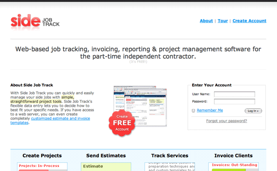
Here are some great pages that get a pimpin’ passing grade.
Talk to me
What are your most-hated product or service pages? Your favorite? Did I miss any particularly obnoxious practices?
Was it as good for you as it was for me? Let me know, people.
Note: This article was accidentally deleted (or SOMETHING). I managed to restore it off some weird site that cached my RSS feed (yay weird sites!). Sorry, all your comments have been lost…


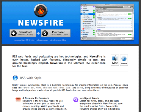
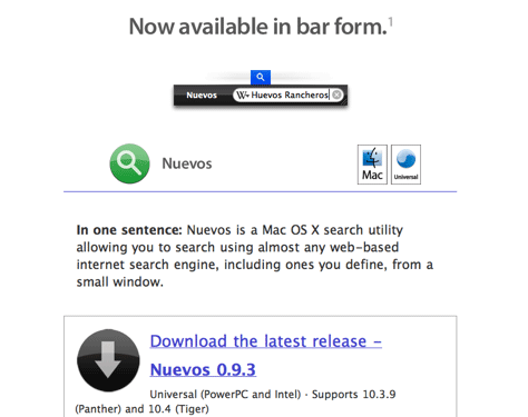
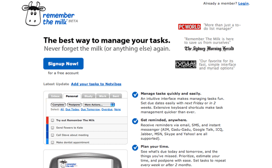
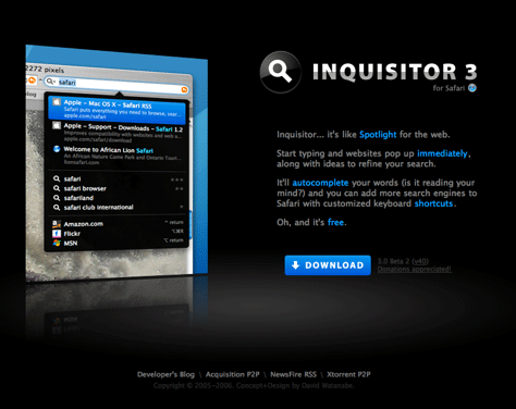


I admire the product — and its homepage is to-the-point and informative — but I must say that <a href="http://www.e-texteditor.com/">E Text Editor</a> would be twice as good with a different name.
Pimps aren’t made. They are born.
really loved the article and also the language, you put the pimp back in pimpin.
You’re correct. It’s hard to identify whether it’s marketing or design. For me, this falls under information architecture. A kickass IA gives you the very best foundation for design and then the marketing aspect falls with the words used. Somehow, there’s an interdependence.
I refer to it as my site trifecta. The IA is the information gist & wayfinding aspect you have for the product/service; then there’s the web design of the IA ; lastly, the perfect wording is the marketing aspect.
Getfirefox.com site is a another perfect example of a pimp-your-product done right.
Re: E Text Editor
Haha I just spent about 5 mins trying to find the actual homepage to download it.
Good read, launching the app is only the beginning. If you build it, they will come is a lie.
Thank You. Süpersin
How do you pimp a not-for-profit product such as a donation?
Hello slash7.
thank you very good expression…
Great tips, Most important for me – make it easy for people to find you. Come up with a searchable name. Create a dedicated product page, ideally with a reasonably meaningful and short domain name. Thanks!
So I agree, that if you want to sell something, first it must be easy for people to buy it and choose, secondly, if buyers have questions, you must provide them with answers.
You have some interesting ideas. Here is my vote for a lousy web site. I stumbled across it and after 20 minutes could not find a simple explanation of what their product is. One can glean a lot by reading faq, etc. but I still have only a vague idea. It is a huge web site one can easily get lost in.
http://wiki.supermemo.org/index.php?title=Main_Page
Oh noooooooooo! the comments I left were the bestest evar tooooooo! Pimp on.
How do you pimp a not-for-profit product such as a donation?
great article, thanks for sharing !
clash of gangs hack
slash7 with Amy Hoy » Blog Archive » Pimpin Products Aint Easy