It’s Time to Redesign the Sales Page, Part 1
Before the Redesign
So you’ve got this product. So I’ve got this product.
It’s totally unique, the only entry in its field, and everybody knows it. It’s a rookie entry into an extremely crowded (if not particularly well-differentiated) field. Almost nobody knows it exists.
It’s a time tracking application, and it’s called Freckle Time Tracking. And it’s totally different, but who knows and who cares?
Sizzling steak—yum! Raw meat of unknown pedigree, not so much
The product site sucked. We focused on building, launching, and polished the product. Naturally, I wanted to build substance before trying to add—much less sell—the sizzle. The app itself has plenty of sizzle but the product site? Soggy.
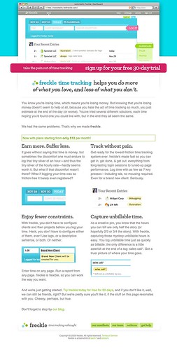
This is what the product site was like, circa a couple weeks ago:
Go ahead, click it for a full-sizer, complete with legible text.
And that was it. There’s no screenshot of a site tour or a screencast because, well, there was no tour, no screencast, no list of features, no… anything.
Not just an ugly face
Aside from being generally objectionable on those grounds, it was ineffective.
People didn’t understand what the service was. Our conversion rate was pretty typical (just under 3% sign up for accounts), but I think we can chalk that up to New App Novelty Syndrome more so than to anything else.
Moreover, it’s ineffective because it doesn’t convey what really makes the product difference. The copywriting hints at it, but doesn’t go all the way. The best parts of Freckle are left hidden (partially because they weren’t all there when we made this first site).
Lastly, and perhaps worstly, because it’s embarrassingly bad and we perceived it to be ineffective, we didn’t promote the product. And that’s a kiss of death.
Why the old site had to die
- Because it was ugly and useless, it was ineffective at promoting the wonderfulness of our product.
- Because it was ugly, useless, and ineffective, we didn’t want to waste many potential ‘first impressions’ on it.
- Because we didn’t want to waste first impressions, we didn’t pimp it.
- Because we didn’t pimp it, it didn’t get traffic.
- Because it didn’t get traffic, people didn’t know about it.
- Because people didn’t know about it, they didn’t sign up.
- Because people didn’t know about it, and most importantly because they didn’t use it, we didn’t get buzz.
- Because we didn’t get buzz, we didn’t get serendipitous exposure.
And here the situation turns around and bites its own tail. Without serendipitous exposure, we didn’t get signups, which would beget buzz, which… you see how this is going.
For want of a shoe, the kingdom was lost.
If you polish shit, all you get is shit that’s shiny
Obviously a complete redesign was in order, and I don’t mean just the visuals.
There were all these other problems. The content was insufficient. The content was badly written. The tone of the product site didn’t match the app. It wasn’t effective.
If that site were a house, it’d have an acceptable front façade, but only two outside walls and half a roof. And no furniture. And probably there would be ground squirrels colonizing the first floor and puffins eating away at the foundation.
And what can you do when puffins start eating away at the foundation of your house? You firebomb it and start over. Stinking puffins. It’s impossible to get rid of them once they get settled in.
So I didn’t start by analyzing the current site and figuring out how to improve it bit by bit.
You don’t polish things that don’t work at all, which were wrong in their very conception. Hello, shit polisher? Your deceptive local maximum is calling.
No, you replace them with something that’s fundamentally going to work, and you polish that.
And to be able to build something that’s fundamentally functional, you need to get clear on your goals.
Enough philosophy—Let’s talk numbers
Our goal is to be “ramen profitable” on Freckle alone—for four people—by January 31st, 2010. Normal numbers just aren’t going to do it.
To be “ramen profitable”—to be able to pay all our bills and be able to buy cheap blocks of instant noodles—we need to have about five times the number of paying accounts we have now, assuming the same distribution.
That means that we have to:
- not waste time and resources reaching people who won’t like Freckle anyway (e.g. opposite of the Right People)
- reach our Right People more effectively
- convince more of our Right People to sign up
- convince more of our Right People to sign up for / upgrade to paying accounts
- convince more of those to use the service regularly, and keep their accounts open
Now that we have goals, the question becomes: how do we achieve them?
What happened next? How did I start? Did I make it?
Obviously the newly redesigned site is online now. You should check it out and see what happened. But there’s more to the story.
Tune in for the next installment on Friday, where I’ll explain how I broke down those goals into design requirements, and how we got from there to the current site. I’ll also talk more about the numbers.
Don’t miss the next post: subcribe to my RSS feed.
Feed reader averse? No problem, sign up for email delivery of new posts.
And, yes, obligatory modernity: If this stuff is up your alley, you should follow me on Twitter, too.


Just to throw in my 2 cents… the redesign is way, way better than the original.
I love how a lot of the updates are meaningful (i.e. content-related). Freckle is expressed much, much better through the refined copy. Kudos.
And I know what you mean about not wanting to waste first impressions on something that hasn’t been polished yet. I thought I was the only one to think that way 🙂
I must admit, your goals seem to be rather high (re: 5x paying accounts in 4-5 months). But then again, there’s nothing wrong with reaching for the sky – good luck!
(hopefully this will aid your blogging breath)
Great article, but one question: Who are the "Right People"?
The design of the app looks very "fun, friendly, and female" but not exactly professional or studio grade. Is that what you were going for?
That being said, I much prefer the new design, it makes much more sense and the call to action is the first (and most red!) item on the page. TRY THIS, and hopefully, BUY THIS.
I just think you need to focus now on who your customer is and further refine the site to that market. Unless you are effectively targeting the group I’ve briefly outlined above?
Ryan, yeah, our goals are high but so are the plan 😀 You’re so not the only one who feels that way about first impressions. So we should all really focus on the first impressions so we can pimp our stuff.
Nathaniel, Right People is a concept I stole from Havi Brooks. She doesn’t have a page that explains it outright, just used in context, so I didn’t link it up.
Here’s the general idea, though:
So, I definitely am not appealing to "female." I don’t care what gender my customers are, of course. And for that matter, they’re mostly male. 🙂
There are professional studios using it, although they’re small they do a lot of big name work. We also added a couple minor feature tweaks just for lawyers, so we’ve got lawyers too. I’m not going to name them cuz I didn’t ask first, but take my word on it.
In my opinion, there are a lot of people out there who are so SICK of the "omgz we must be prrrrooooffesssional and that means grey and blue and serifs!"
And they don’t want to try to use software to patch the problems in their hierarchy. (E.g. requiring pre-defined tasks lists before minions can enter time, approvable time sheets, etc.)
They just need software that gets the job done quickly, effectively, completely and with flair.
Their time tracking software doesn’t have to enforce their "professionality" — they know it comes from the work they do, not the color of their time tracking software. And they LIKE the colors of Freckle and its general cheeriness, not to mention how awesome it is at helping them analyze and shepherd their time use.
Those are my Right People and I know there are more than 200 out there. 🙂
Of course the marketing message needs more work, but I think the 2 new pages (home and tour) are a good step in that direction, because of the headline content (curious, a bit fun) and the highlighting of which features we offer, the music used, etc.
My real approach for marketing Freckle is to create free tools and toys that appeal to the people who are Right People and don’t know about Freckle. I figure those things will seal the deal more so than the Freckle home page.
Guess this turned into a post all its own! Thanks for asking 🙂
I appreciate your comments and position! Well said. My point is, though, that your site design doesn’t seem to match your target demographic.
There are interesting ways to reach lawyers beyone serifs and navy blue. 🙂