designer: divorce thyself
Being a designer is a tough gig. Oh, I know, poor me, right? But wait. Let me explain.
As a designer, it’s easy to make a fool out of yourself. Even the most self-deprecating designer has this problem occasionally, and so do I. We want to love all our designs. They are our children, even if they are ugly, and even if we look back and go “Ew, what was I thinking? Did I have too much crack with my Froot Loops that morning?” We say it fondly, even if we don’t admit it to ourselves, with a kids-these-days head shaking.
<span id="more-3887"></span>
We love them because they are something that we took out of our brains and laid down on paper or in bits in Photoshop. And often enough we don’t know, at first blush, when they’re just not good enough. That knowledge comes only later, a cold sweaty revelation. It’s hard to be objective sometimes, and when you start out, it’s nearly impossible—either you think all your work just totally sucks, or you think it’s great, everybody look at me. Both cases are embarrassing, although the latter is worse. When I was learning, I vacillated wildly between the two. I can be pretty hard on myself, and I can be pretty assured of my own talent (some people might call that arrogance) at other times.
Ooh, It Hurts

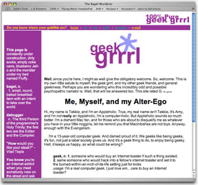
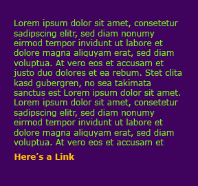
Unfortunately, I don’t have many of my worst designs to show you because they mostly happened within about 3 years of my starting out, and gosh, that was the time between 11 and 13 years old, and I had a Power Mac 7300 with a bad internal IDE controller which ate a couple hard drives before I figured out what was up. All I can say is: Dark purple background, green and orange text. The designs I do have aren’t great, but they’re not terrible either (see above screen cap, thank you Internet Archives. If only you went back to 1996-1997 so I could now access my truly regrettable work).

No One’s Perfect
I admit that sometimes even now my judgment can be suspect if I’m able to bypass the sleep-on-it waiting period. That’s my best advice, really—see if you still love it two days later. If so, then you’ve probably found a winner.
Of course, sometimes clients make us do awful things in the name of “the customer is always right,” despite our best attempts to convince them otherwise, and that just can’t be helped. Tossing stuff in the trash (that will never see the portfolio!) while kissing the check hello, and the client goodbye, is a time-honored ritual among designers.
And don’t forget that you should never stop trying to improve by studying the stuff you like/envy/curse yourself for not doing and through reading books and articles, and talking to people. Nobody’s ever done learning. I’m certainly not.
Help, I’m Writing And I Can’t Stop
I swear this post had a point. Actually, it had two points. One, I wanted to say something encouraging to anybody who’s trying to learn and wrestles with this problem, because you’re not alone—it’s practically a right of passage. (If you never make mistakes, you must not be trying hard enough.) And it never fully goes away. Everybody has their bad days.
But I actually started off with the goal of announcing something, and so we come to point two. I am going to redesign Slash7 yet again because it’s just not right the way it is. I can’t really put my finger on it—and I can’t really claim objectivity, either—but it’s just not nearly as good as it ought to be and I’m feeling that familiar, slightly nauseating case of Designer’s Regret. Maybe it’s just because I fell into the ol’ flowers-at-the-top cliché, even though I have some awfully nice little flowers. Maybe the color scheme is just not a right fit for the content. But I’m just not feeling it.


Well, it is glad to know you’ve come to terms with yourself.
Two posts which mention crack in one day? Suspicious if you ask me…
While I do like this design (and take my opinion with a grain of salt because I have no design skills), I thought your green and white layout had more energy. I was kind of sad to see it go.
I’m always hard on myself. I never believe any of my designs look good or are implemented well (This opinion is probably shared by all). I keep going anyway — because eventually I’ll have gone through enough "wrong way’s" and start getting things right. Until then, I trudge on…
I can’t wait for the new design for slash7, I’m sure it will be beautiful. (even so, cliche or not, I liked the flowers.)
-Lateralus
Gonna have to give it a try 🙂
Very clear 🙂
That is strange 🙂
Well done, nice instructions 🙂
I liked the old one better
That is strange…
I think it would be usefull for other users also…
Thanks for taking the time to do it.
i am not sure as to why!
Not really new…
Thanks for taking the time to do it…
Not really new 🙂